NICHOLAS ODDY, STREET SIGNS & THE HIGHLANDS
NICHOLAS ODDY, STREET SIGNS & THE HIGHLANDS
This post all started from a talk given by Nicholas Oddy as part of the PDE ‘Design and Technology’ lecture series. As the head of design history & theory at The Glasgow School of Art, Oddy’s talk gave a much more chronological account of the history of design than I’d ever heard before, jumping around to point out all the important movements and moments. This really isn’t something I had any knowledge of at all, and so having such a knowledgeable person teach it with such enthusiasm made it incredibly accessible to someone without any base knowledge.
But sadly this story isn’t about Oddy, as enthusiastic and friendly as he was, it’s about my highlight of the talk: the comparison between British and French street signs. Within the presentation Oddy spoke about the british signing system, showing an image of the British street sign for ‘school children up ahead’, whilst giving a small amount of history and talking about its designs. As spectators, we could all accept that the sign was well designed but it was clear that Oddy was struggling to quantify what about it made the design so clean and crisp. It was only when he threw up a picture of the French equivalent sign in comparison that we all understood what he was trying to say in a collective round of laughter. The two showed the difference between clean, proportionate and considered design and design that is clearly trying to complete a task in the simplest way possible and with minimal effort.


I thought this was funny. Since the talk, I’d mentioned it to a few friends, pulling up the images and thinking I might get a laugh or at least some interest, but I was only ever met with confused faces and people asking “What’s the difference?”. I find this fascinating that the difference between the two designs could elicit such an easy reaction from a room of design students but so little reaction from what I’m calling ‘the rest of the world’. There’s clearly a lack of ability to appreciate the subtleties of the British design, the consideration given to its proportions, but for an object seen by millions every day, how can this not be considered important?
As well as this, I think the history of these signs is also incredibly important within the British design sphere. The British road signage system was designed in 1965 by Margaret Calvert and Jock Kinneir in a commission from the government aiming to standardise the information displayed on road signs. This commission would define the information displayed on signs throughout the country, seen every day by millions and needed to communicate information in the most effective way possible. One huge method of standardisation within this was the classification of signs into 3 distinct shapes which communicate different intentions. As well as this, the standardisation of the typeface used on signs was vital for ensuring easy and consistent legibility. The aptly named ‘Transport’ and ‘Motorway’ typefaces used on road signs are sans serif fonts designed specifically by Calvert and Kinneir to allow for legibility when used in mixed case fonts in short uses. Who knows, I might even steal them for some of my own work.


The consideration given to this standardisation of the signs is what makes them a great example of coherent and functional design, however it is the pictograms on certain signs that I believe allow them to become truly ‘great designs’. Within this pictography, the goal is always to communicate the maximum information possible in minimal imagery. For some more frequently used signs, this means an excess of simplicity so as to be clearly recognisable but not distracting, however for the more obscure and complex signs, this balance of simplicity to communication is where Calvert’s design’s shine…
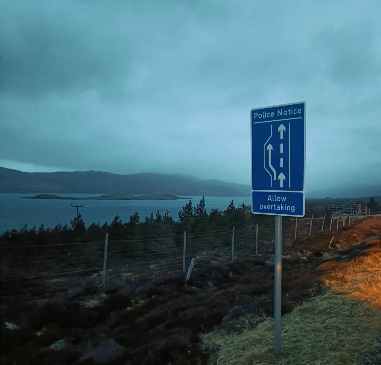
Being a product of a city upbringing, I’m finally learning to drive at 21, meaning that for the first time I’m actually starting to appreciate and take notice of these signs that have forever been in my peripheral. Now that these signs have moved out of my blind spot and into my headlights (sorry), they’ve become hard not to look at and this was all the more poignant on a recent camping trip around the Highlands and North coast of Scotland. In these awe inspiring and remote settings, the street signs serve as the only form of communication to road users but also have even more importance on blending in and looking inconspicuous in their environment. They need to be clearly visible but can’t be an eyesore, nice to look at but not distracting, and I honestly think they achieve this. In these settings, you also get some of the more obscure but most beautifully designed signs, some of which are my absolute favourites.


The main one of these for me has to be the sign for deer up ahead, I genuinely think this design is stunning. Communicating such a complex idea and image in just a silhouette is an incredibly impressive feat. The proportions of the deer are perfect and the consideration given to the legs and how these are placed in a way that fully communicates the dynamic nature of the what’s ahead; identifies so strongly with the animals form and maintains the angles present within the triangular sign is absolutely perfect.
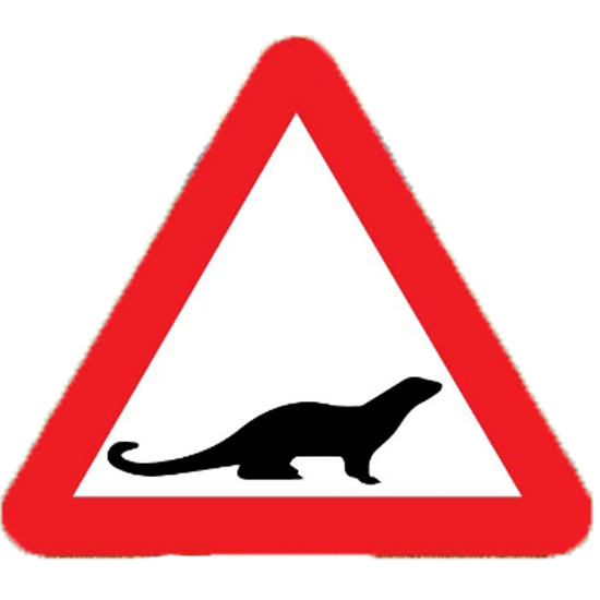
A couple of other favourites I’d never seen before: the sign for otters ahead is a brilliant one. By placing the otter so low in the framing of the sign it almost communicates where to look from them and how they will appear in the road. As well as this, I saw the sign for ‘Risk of grounding’ for the first time. This sign is objectively hilarious but when you actually look at what it’s trying to communicate, it manages to convey a significant amount of quite complex information in an incredibly simple design.


Here’s a great interview with Calvert from the Guardian where she talks about how, interestingly, the signs still annoy her today as she can only see the imperfections in them. She talks about how she sees the job as “possibly the biggest graphic design job ever”, at least I can’t think of something bigger.
(If you can surely leave it in the comments…)
